Horns Gas & Plumbing.
A family run local Gas & Plumbing business based in Lismore NSW.
First established in 1986, the business had never invested in a professional brand image and digital presence. So this project was a fresh start to create.
The brand image was crafted to underpin both heritage and reverence of the brand. The new branding not only pays respect to the heritage / grass roots of the brand, it marks a new chapter – post Lismore floods and the pandemic; to rise up and move forward.
BRAND STRATEGY
CREATIVE DIRECTION
LOGO DESIGN
WEBSITE DESIGN
COPYWRITING
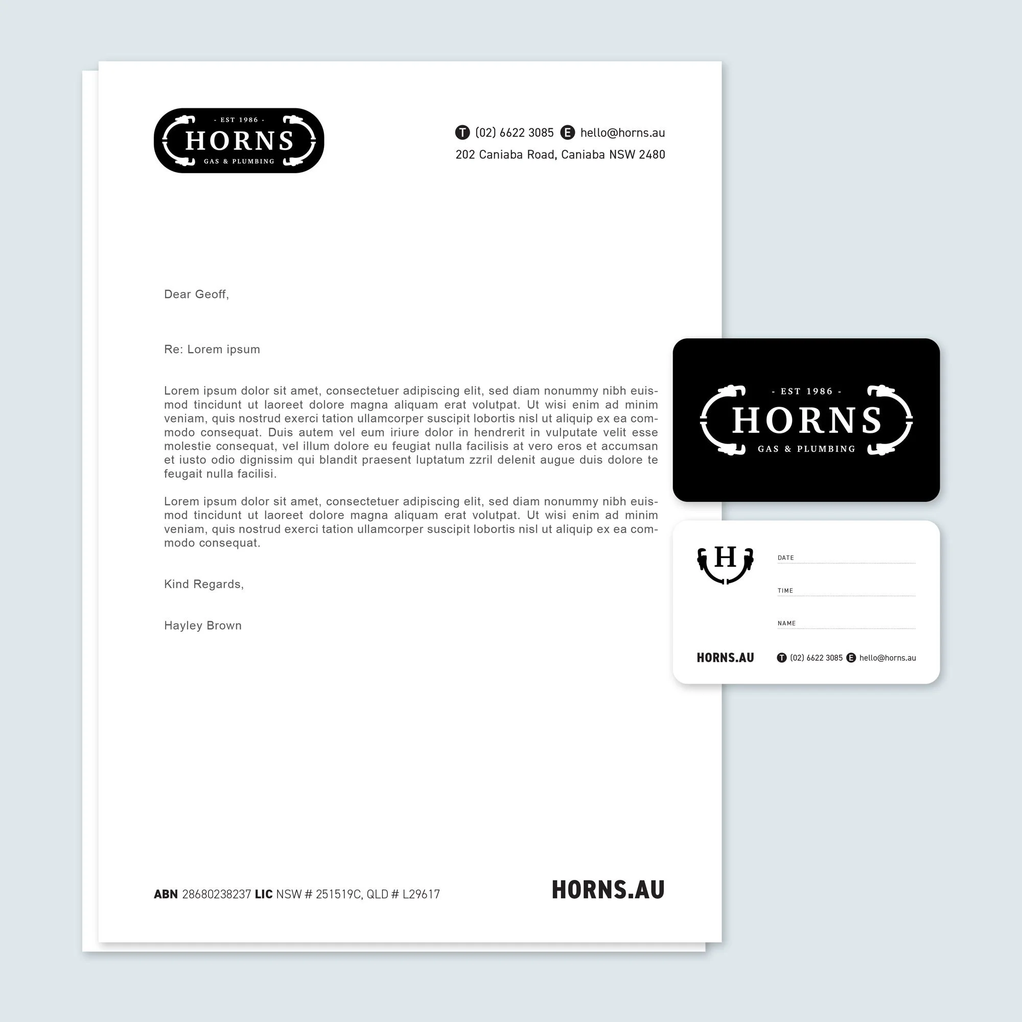
CORPORATE STATIONARY
CONTENT CREATION
Logo Design
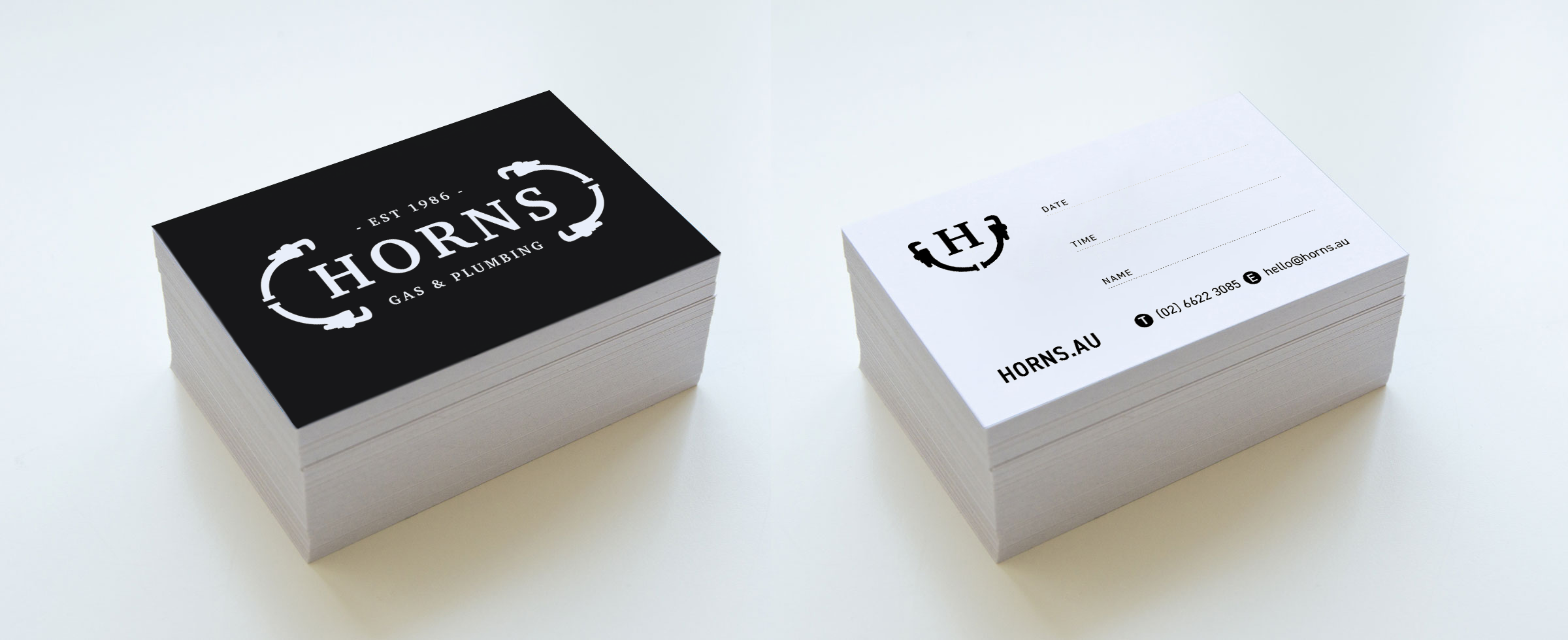
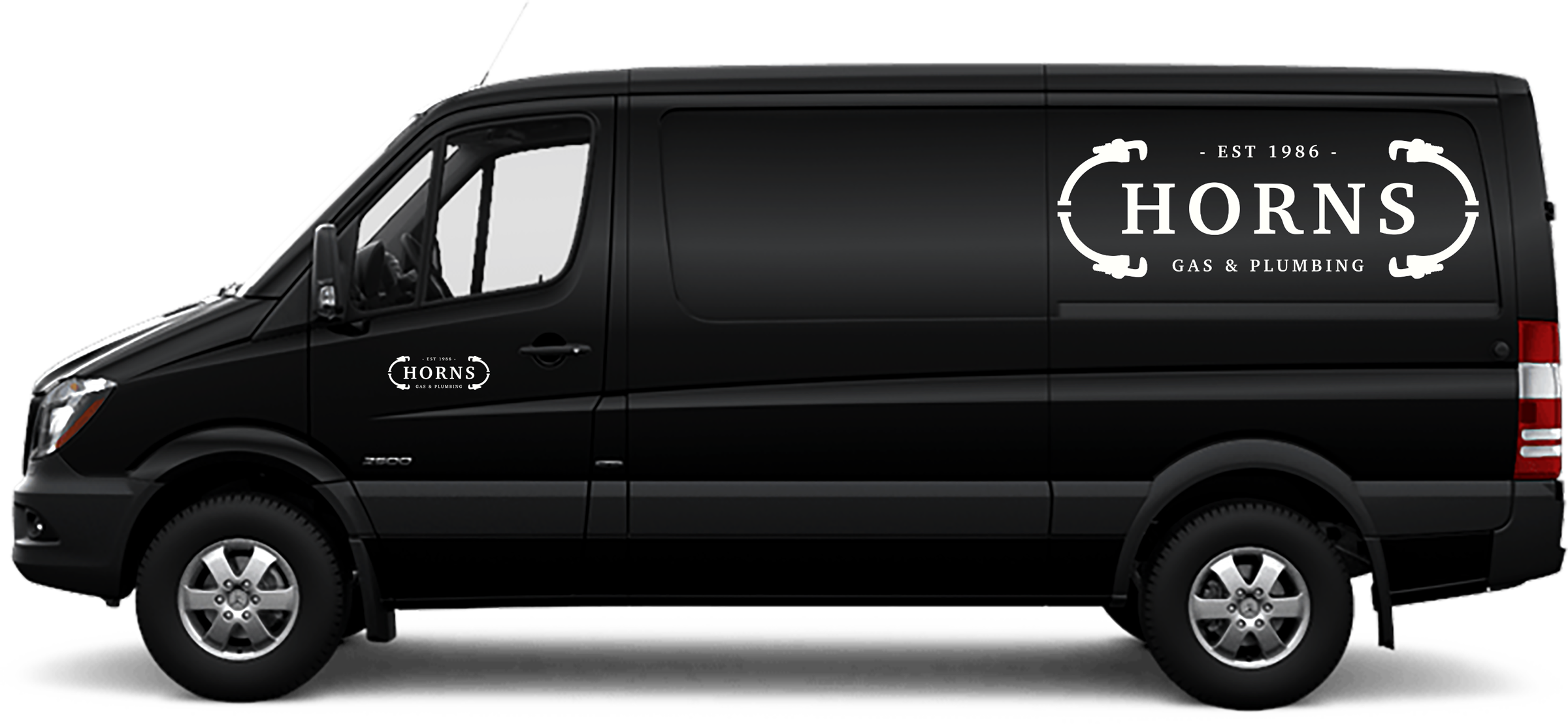
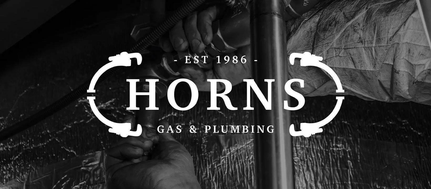
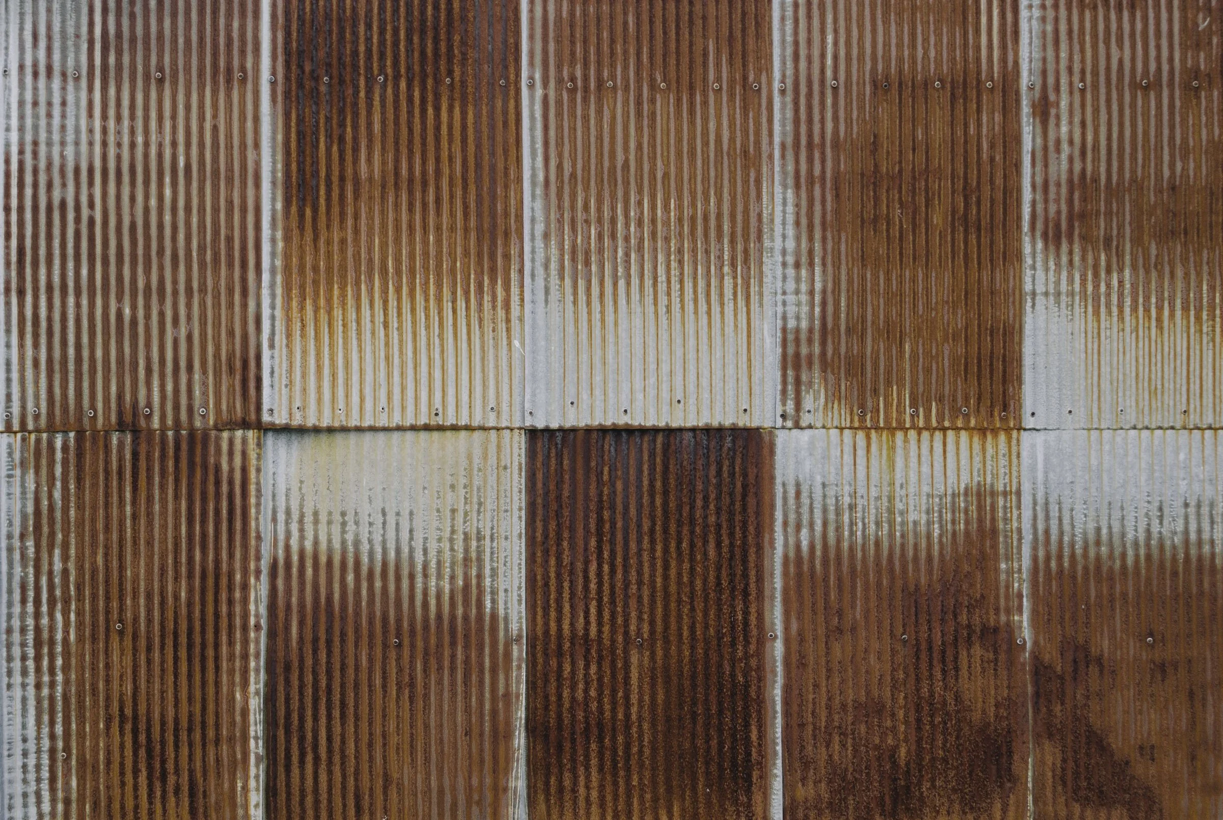
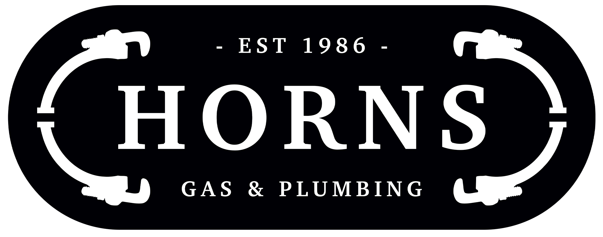
Designed to capture the brand heritage, we crafted the new HORNS Gas & Plumbing logo with a solid and classic serif font, encasing the design in a pill shape featuring stylised wrenches that form the shape of horns.
SECONDARY BRAND MARK
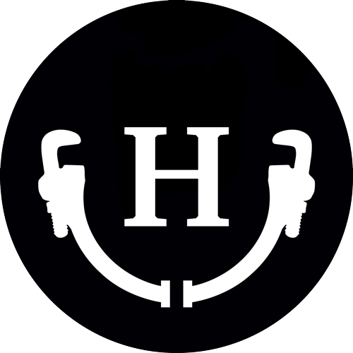
We also created a simplified logo mark. Flipped 90 degrees upright, the horn shape / wrenches resemble two arms in the air holding a wrench in each hand, encasing the letter H.
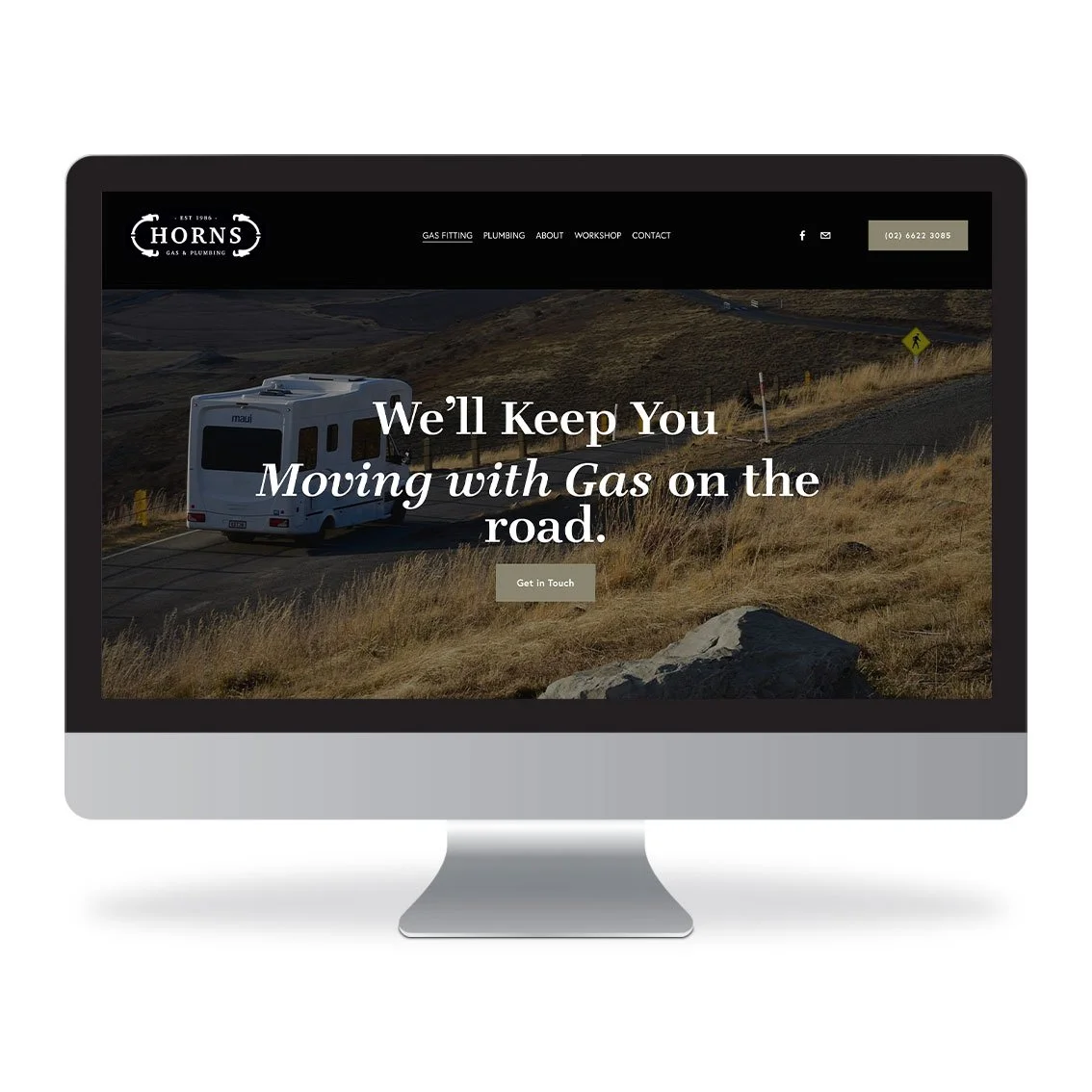
Website Design
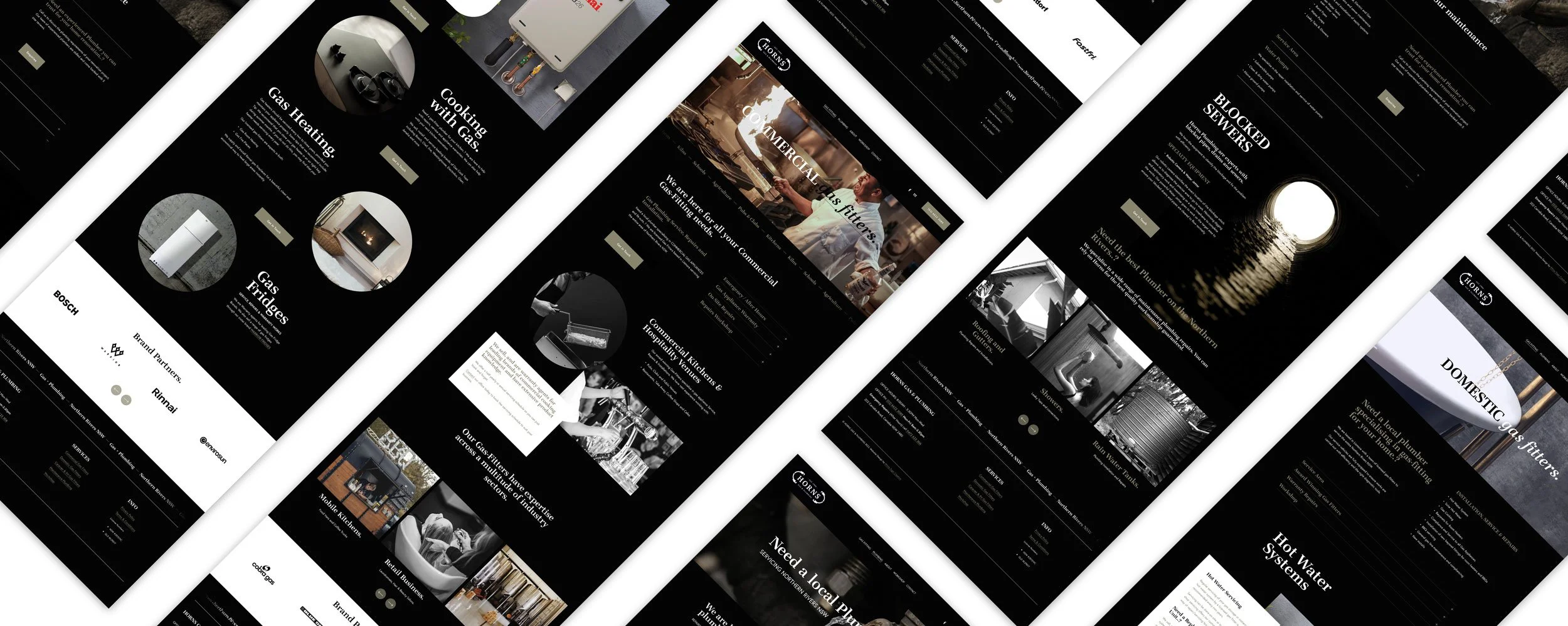
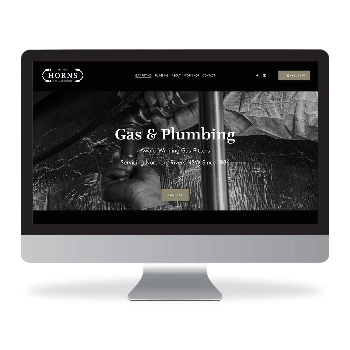
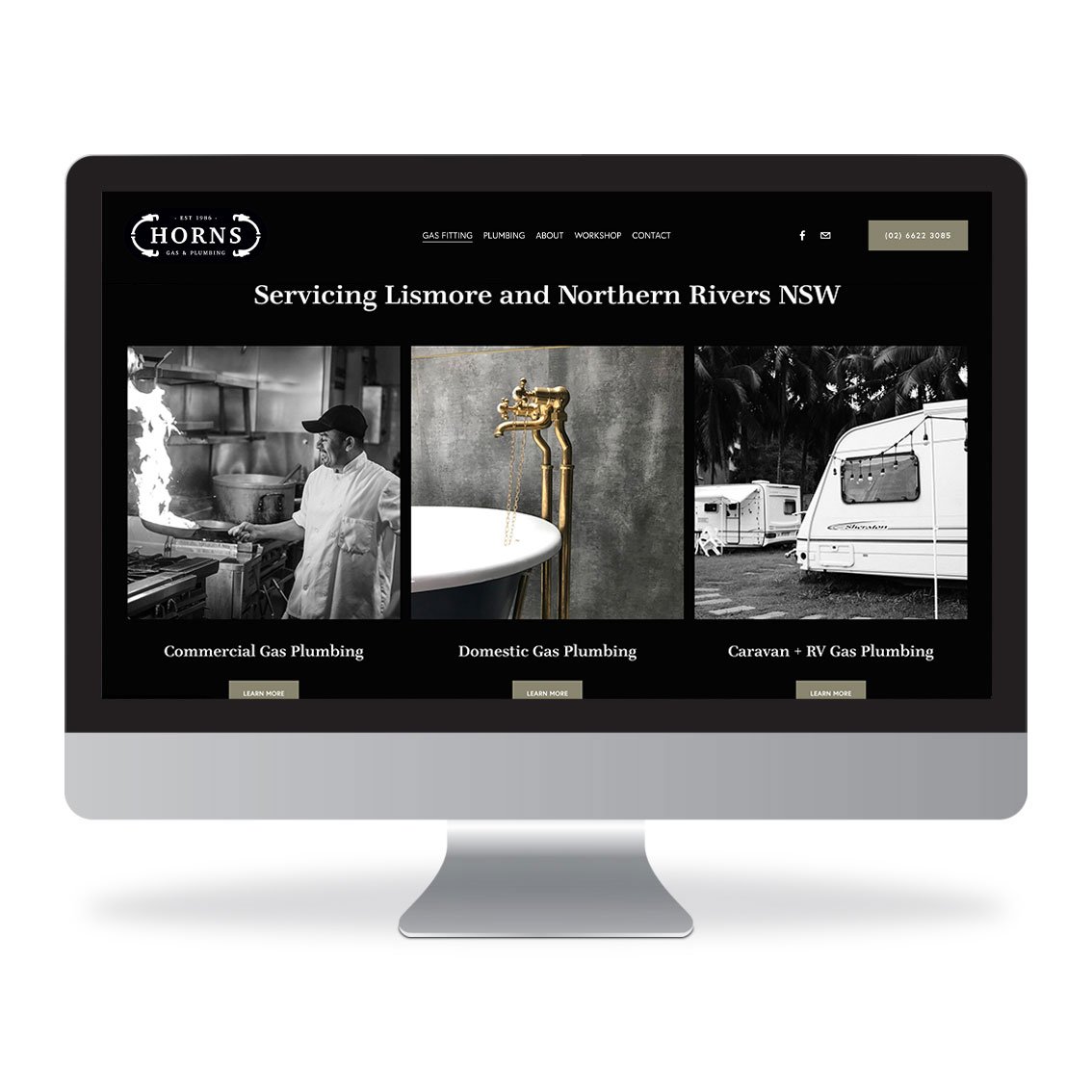
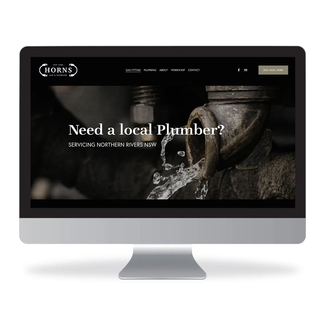
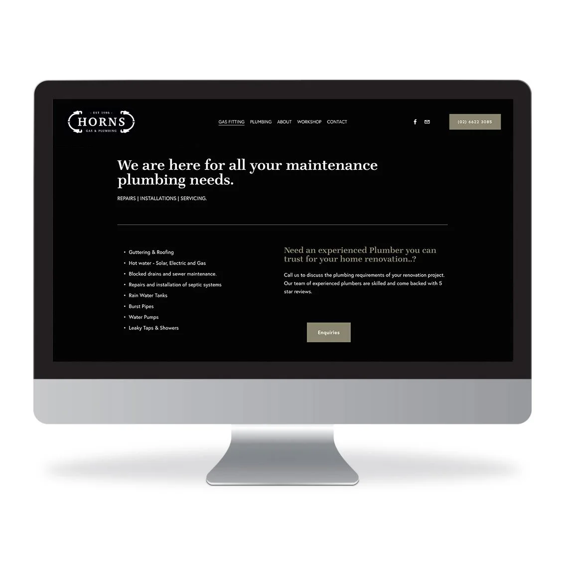
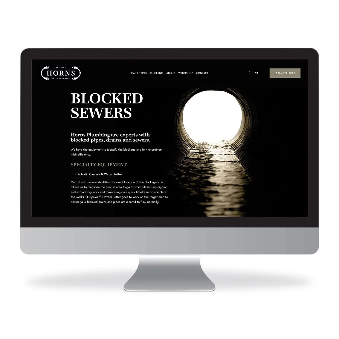
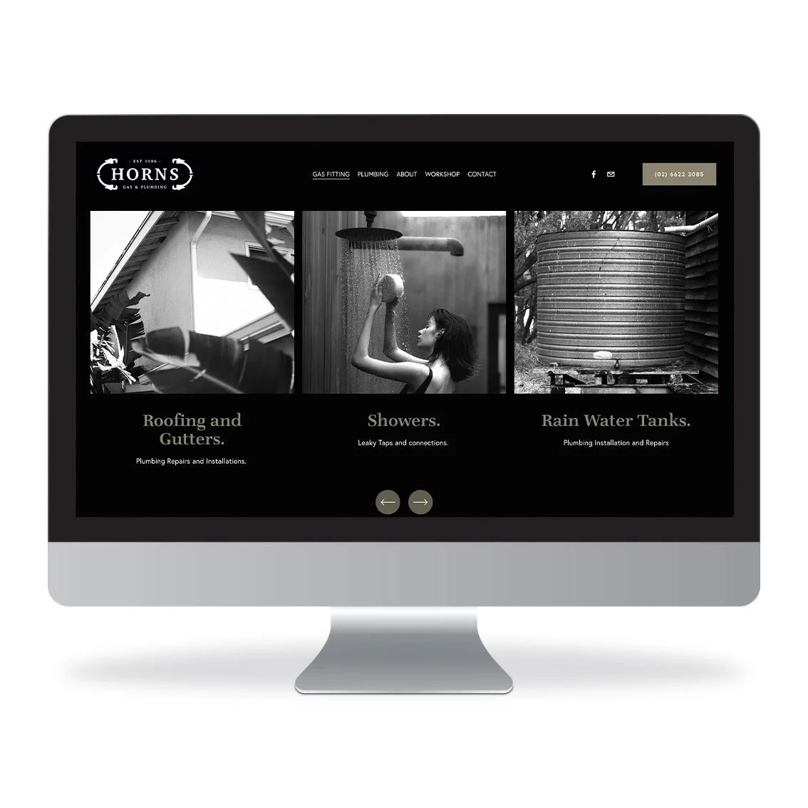
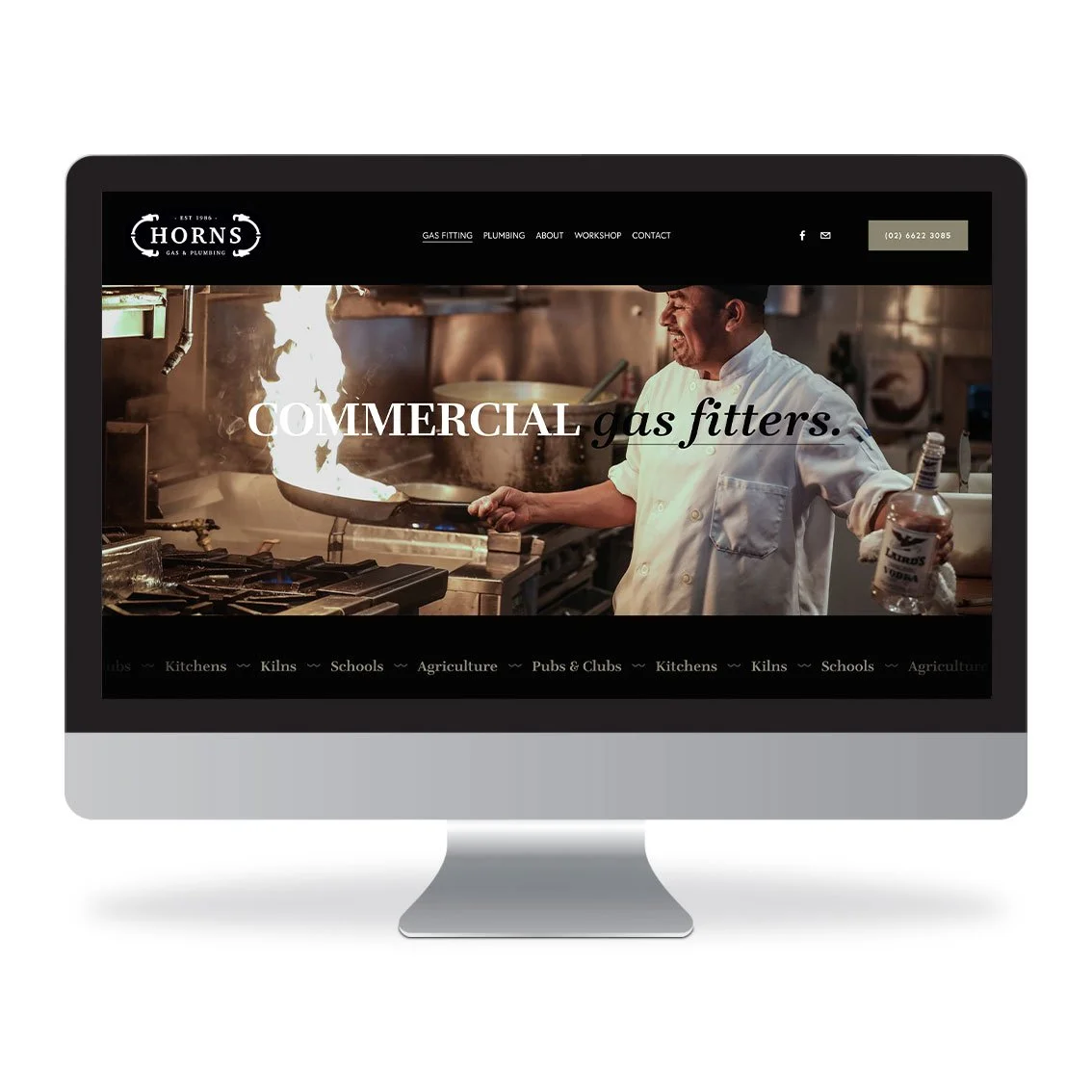
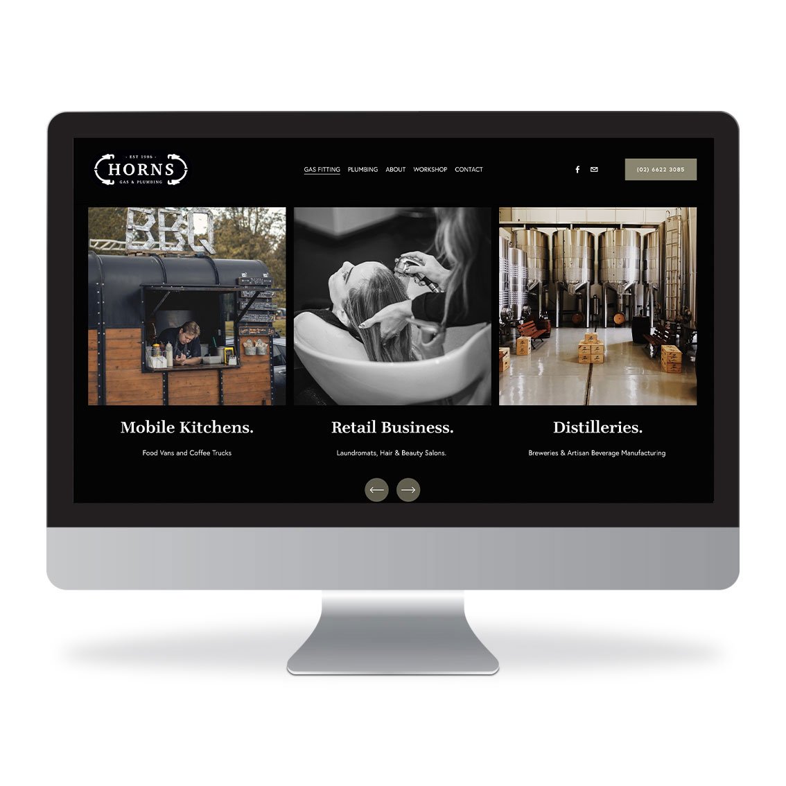
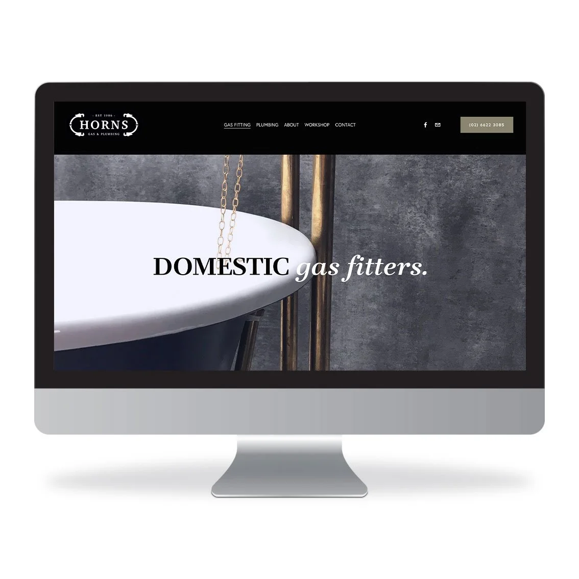
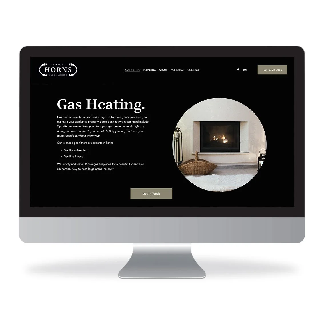
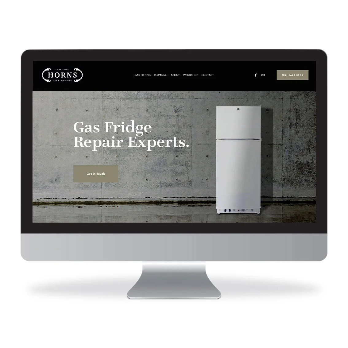
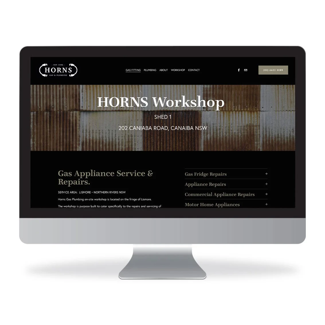
The new HORNS Gas & Plumbing website was designed to capture the heritage of the brand which we peppered with a contemporary overlay aesthetic.
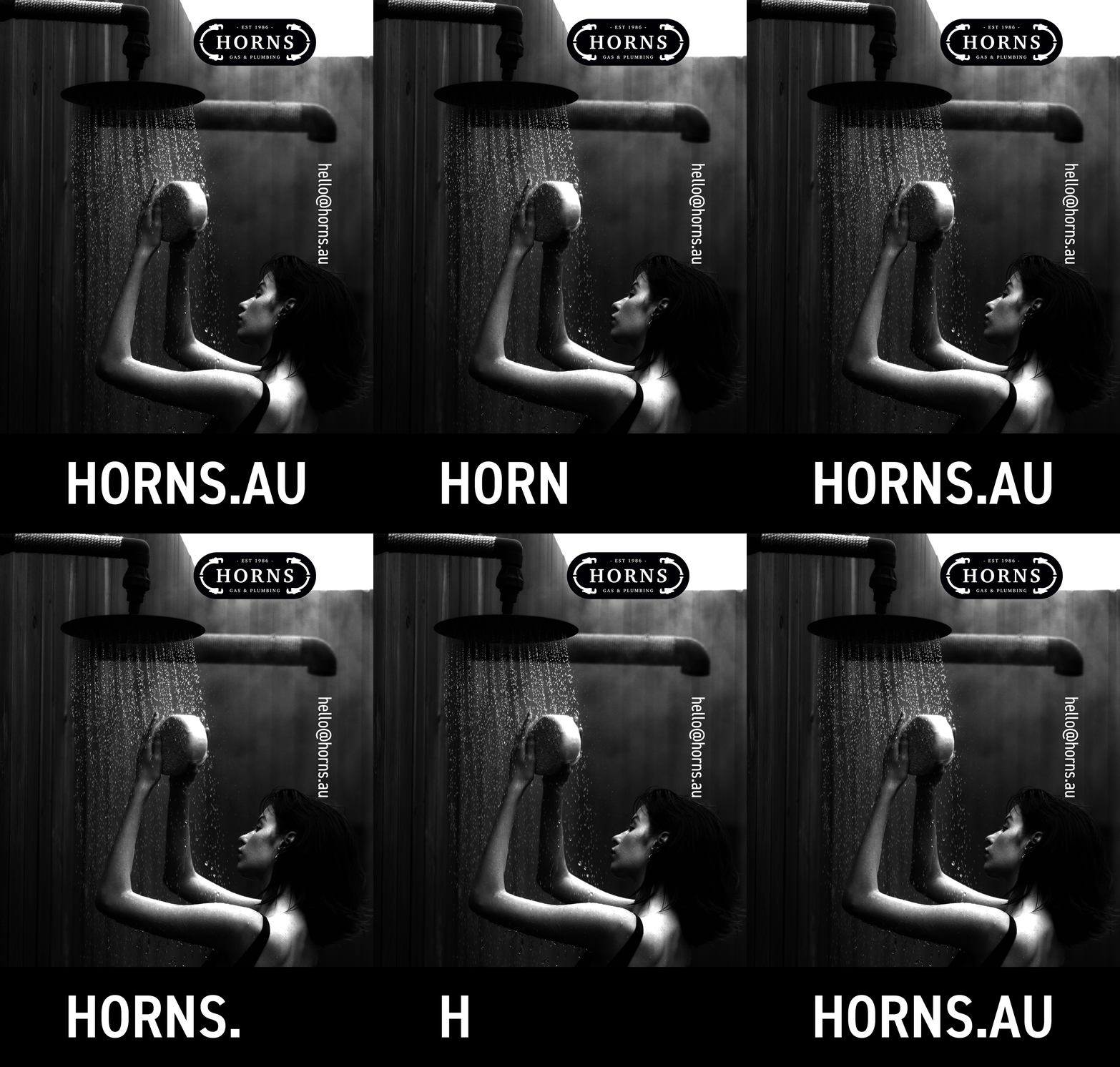
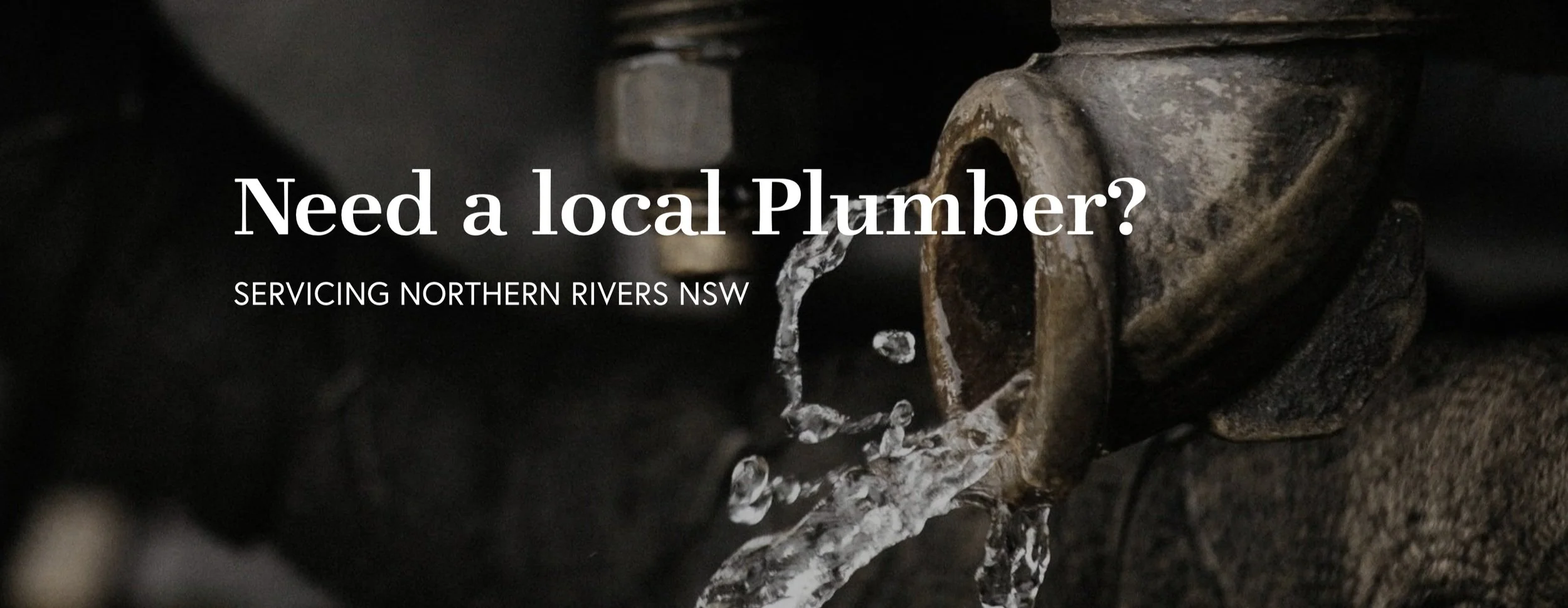
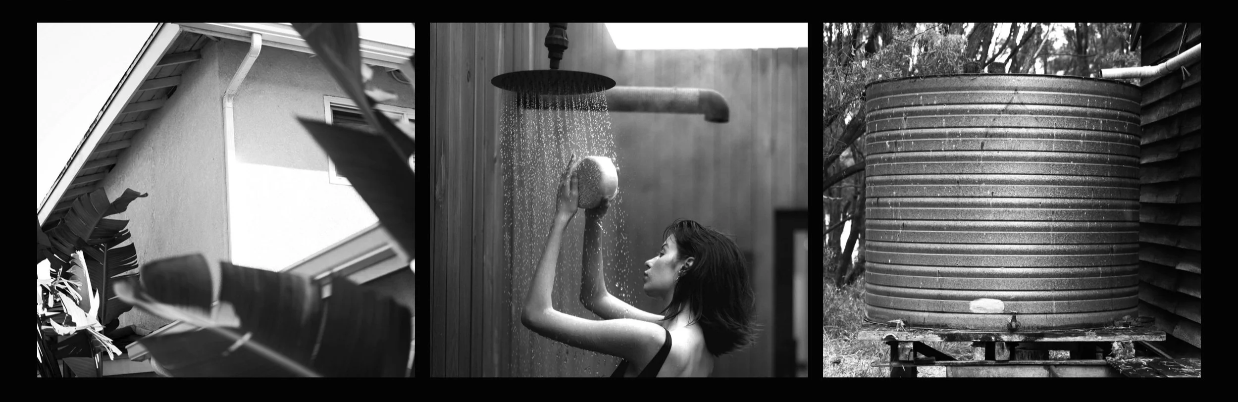
The use of black and white photography lends to the brand history, together with a mix of earthy tones to underpin the grittiness of the plumbing business.
The new HORNS website replaced a very old outdated site that was lacking in all aspects of branding, content, and functionality. We worked strategically to define the business model in order to best streamline the services and content flow throughout the site architecture for a cohesive user-friendly experience; designed to both showcase and educate.